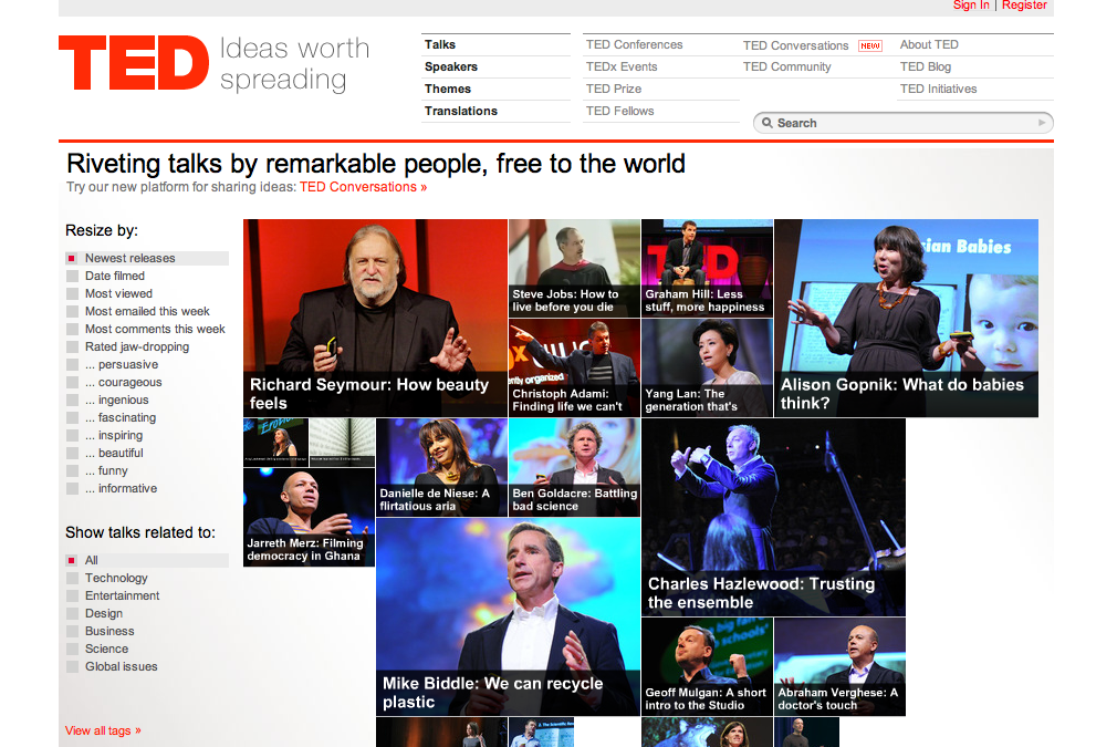
The following are reasons that I like TED.com. This is a picture of the page...
The designer uses contrast well. For instance contrast is represented clearly by the use of the color red of the TED logo on the upper left corner. The background of the entire page is white, with gray background in the submenus, and the black and red colored texts on the page stand out strongly. The images of individual speakers placed centrally are vivid in color. Each image has a black panel with white text naming it's title and it is easy to see who is speaking about what regardless of the size of the image.
The designer uses repetition well. For instance, the fonts on the page relate to each other well. The font used for "Riveting talks by remarkable people, free to the world" is the same font used in the name and title of each individual image panel that serve as links to those talks. Every link around the outside of the page which serves as navigation throughout the TED site is the same font. Other specific directory links are in red, "Sign In", "Register", "View all tags", and red is used to highlight the selected view of the current page (shown in the menus on the left side of the page.)
The designer uses alignment well. For instance the entire left side of the page is justified. There is nothing floating, nothing randomly placed that takes away from the alignment of the page. There is an upper menu bar section divided by a red line from the lower viewing section of the page. "TED ideas worth spreading" is paired with the various ways to look for talks, and these are all separated and aligned together to create an obvious new section of menus.
The designer uses proximity well. For instance as mentioned above with the alignment of the major links to search for talks, they are in proximity to the header. These are the starting places to search and they are along the top of the page. This is very important and helpful so that the audience doesn't have to go looking for where to search. It's on top, and easy to see. The images are also in close proximity to each other when, for example here "newest releases" is selected. However, I'm curious to know WHY are some images bigger than others?
The designer could have added more contrast by not using a gray font on the white background. It stands out, but couldn't something else grab our attention better? Is it really necessary with the red used in strategic places? Either way is fine. I'm personally okay with the gray, but I do feel maybe a darker gray could have been chosen.